Manorvania Postmortem

Manorvania has finally gotten off the frontpage. Man, that was a wild ride. It was fantastic!
17.000 people played. 17.000! That's a lot of people!
And a lot of nice reviews. Thanks guys. All of those mean a lot, every one of them. I specially got a kick out of the ones that mentioned music, as i'd go and show my friend, who did the theme.
Even though i eventually stopped replying (had to, class was hell and there was a point that catching up would have been too much) but i did read *every single one of them*. <3

I've been meaning to write about the process of creating this little game, and the challenges that happened, and the things that i could have fixed.
1- IDEA
I *had* to make a game for halloween. It was some kind of self imposed challenge. I knew i wasn't gonna make a horror thing, as i wanted something 2D and i don't think i'm capable to make 2D horror. Therefore it had to be simple, silly fun.
Suddenly, i rememebered this thing.
That "thing" is just an experiment to see if i could make a good platformer system in Gamemaker. It was originally made for class, but they made me use Unity instead. All that work was for naught. At least the Unity game wasn't that bad.
As i could not use that work for anything, i decided to give it some extra features (text boxes), change a few things and just release it as an small joke.
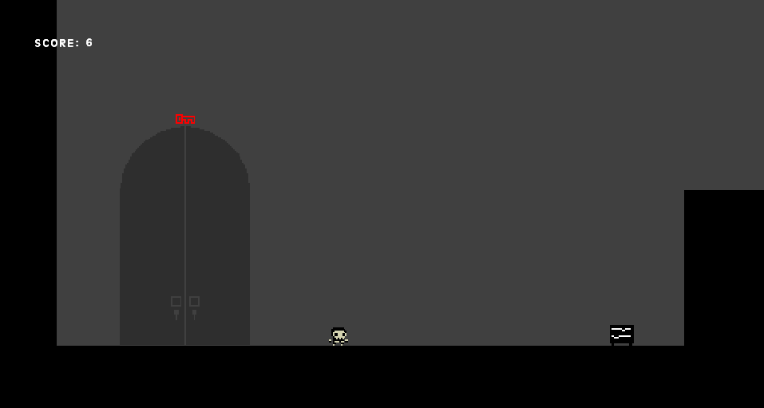
Thinking about it, that was quite short sighted from me. Still, i had that whole system to just tinker away and make a game with! After thinking for a bit, i went with making a true halloween game, with all the cliche horror characters and setting.
2- ART


Eagle eyed people might have realized that the skeleton up there, in the experiment game, is the normal enemy of Manorvania. I mean, it had the animations already done and everything, why throw something that works? hahahaha
(I did have to add 2 frames to the run cycle to make it smoother, however)
Even the bats were recycled. This time, from the class game:


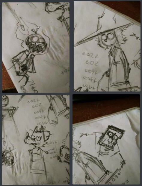
Portraits were another monster entirely. I really, really couldn't visualize the style i was going for. And oh, i did go for a lot of them:
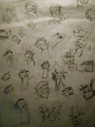
First attempts, mostly based on my usual goofy style for simple characters (feels kinda weird to describe it that way, ahhahaha)
Almost went with something like the Vlad in the lower left. You can see some other couple attempts at the same style with the wolf and the witch, who kept that face for the rest of the sketches, hahahah
(Also some characters that wouldn't appear: a necromancer -replaced by Death, obviously- and friendly ghouls, which were tied to a mechanic cut for time. Also ignore the drawings of myself hahaha)
Second attempts don't really deserve much showing, as i went wilder just to see if it would fit. It didn't. I will keep the smug vlad, however:
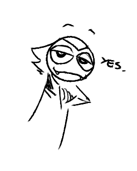
Eventually i went with a more defined, human look, even if it was still cartoony. I made LOTS of faces during this, specially of the main character. It needed to be a bit likeable, yet dumb, while also leaving me the possibility of making him smug and / or kind of a laid back asshole. This is all something i'm realizing in retrospective, as i was just drawing at the time.
Until i struck gold! I really liked this one.
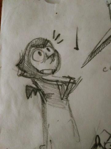
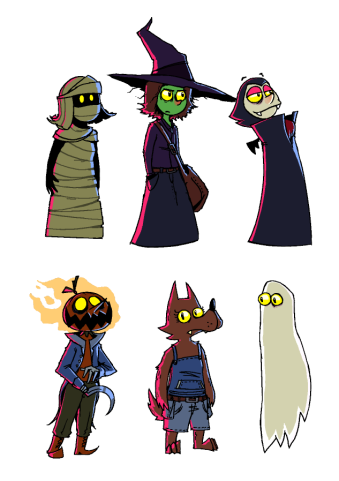
All of the other guys fell into place as soon as that one was done.
And here are most of them complete!
3- DESIGN
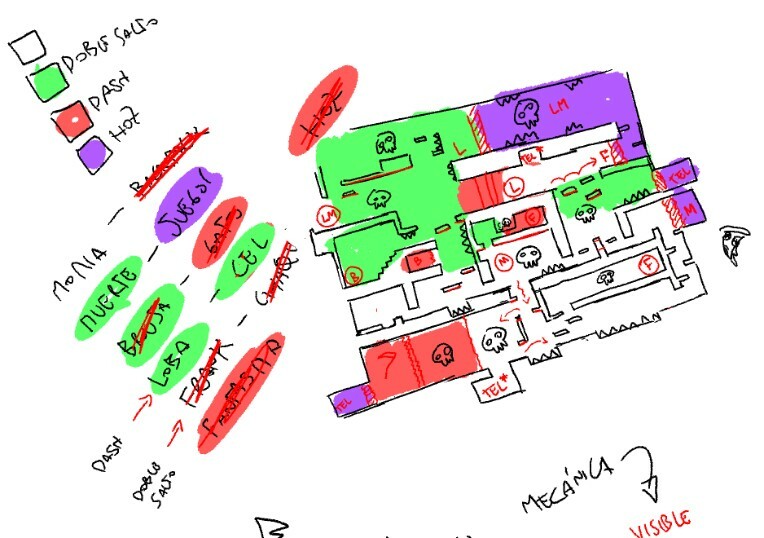
Now, i was gonna write about the design of the manor itself, and the mechanics, but i'm quite tired to be honest, so i'll be really quick.
Basically, separating the whole level in chunks. Depending on the abilities unlocked, the player will be able to go to different parts of the level.
The trick, here, is to make it feel open and interesting:
The path is premeditated. Sure, you go through it at your own pace, but i control where you can go at a given time, and what you can see.
That last part is extremely important. To *see* things. The idea, IMO, of a metroidvania, is to get abilities which change how you perceive the world around you. "Oh, i can get to that platform now". "Oh, i can go through lasers now". "Oh, i can break that wall that i saw a while ago".
The player needs to see that there are places he can't get to yet, and slowly make a mental map of where everything is. Then you introduce a new mechanic, and part of the world gets unlocked, and the player gets to explore a new place and feel smart for figuring it out.
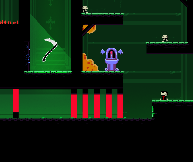
Here the game taunts you with a powerup, but only if you can pass through those red blood lasers...
The only problem here is that, because of the size of the level, everything in Manorvania is stuck next to everything else, and a player might miss these things visually, or forget where they were. (It's not the same than having a big visual landmark for these things, like the boss statues in metroid). I tried my best, hahaha
Also, a powerup should never be used only to open a new door. It should also change the way you traverse the environment.
https://www.newgrounds.com/dump/draw/082d5a9247c3ff8e3cce352293f674d8
(dump link cause can't add more images)
I decided to make lots of shortcuts everywhere. Hazards become speed boosts, enemies become redundant, the power spike is fun. That, along a few secret passages here and there, makes it speedrunnable, which is great fun, hahahah
Another thing: Flow is EVERYTHING. If a jump feels bad, if the jump ends just before reaching the next platform or too early, it feels weird. Moving around must be as graceful as possible.
All abilities add great flow to how you jump around. You can see the mathematics in peoples heads when they get the hand of the movement- jump here, dash here, avoid this enemy, land here. It feels fantastic. I tried countless times lots of places just to see if there was something wrong with the flow, and editer accordingly.
Not everything is perfect however. The mansion is still too cramped for the movement. I realized this way too late.
Specially early on, as the platforming wasn't tuned that much for when you have absolutely no abilities. Oops.
At least this gives a "Picking up the Doom Shotgun when you only had the pistol" vibe. So it kinda pays off, but it's still sloppy, as while i wanted some of that, it didn't need to be that drastic.
...
Also sorry for the phone mission lol
and the final part hehe
it was WAY HARDER before though
also gamemakers html5 kinda sucks dude
4 i think - CONCLUSION
I had a blast doing this. Just that. And had a blast seeing people play it, and even speedrun it. I'm grateful to all of you for the support, i mean wow- you are fantastic <3
Some of you even laughed at the jokes!!! I was so nervous about that. I know i write weird characters. Next time i won't make the main character "write like this dude", i learned it gets old fast, hahahaha.
Next time will have more writing i think?
Big thanks to Juanba for the music, and Porcongo for the sounds. Cool dudes, man. Lots of people praised the sounds and music, and most of that credit should go to them <3
Check out juanba's music!! https://soundcloud.com/bauti777
Also, i decorated my itch io profile a bit if anyone wants to check it out, gotta be presentable, hahahah
Anyways, i'll be closing now. Thank you so much!!! Let's hope next year isn't as sucky sucky, shall we?
Also, might possibly be doing a new project. Hopefully releasing january. Let's see!
-Stop <3
EDIT:
also i know i had a massive mistake with the whole onion and garlic thing
i have no idea how i rolled a 0 on the intelligence check there
I WAS ON THE RIGHT TRACK that's my only excuse
oh that sweet, cursed foodstuff, the onion
Get Manorvania
Manorvania
Mini metroidvania filled with skeletons!
| Status | Released |
| Author | Stopsignal |
| Genre | Platformer |
| Tags | dracula, Halloween, Metroidvania, Short, Skeletons, Spooky, unspeakable |
Comments
Log in with itch.io to leave a comment.
Nice devlog, and congrats on the newgrounds success! Well deserved, and looking forward to see what's next.
thank you!! me too, i can say, hahahah